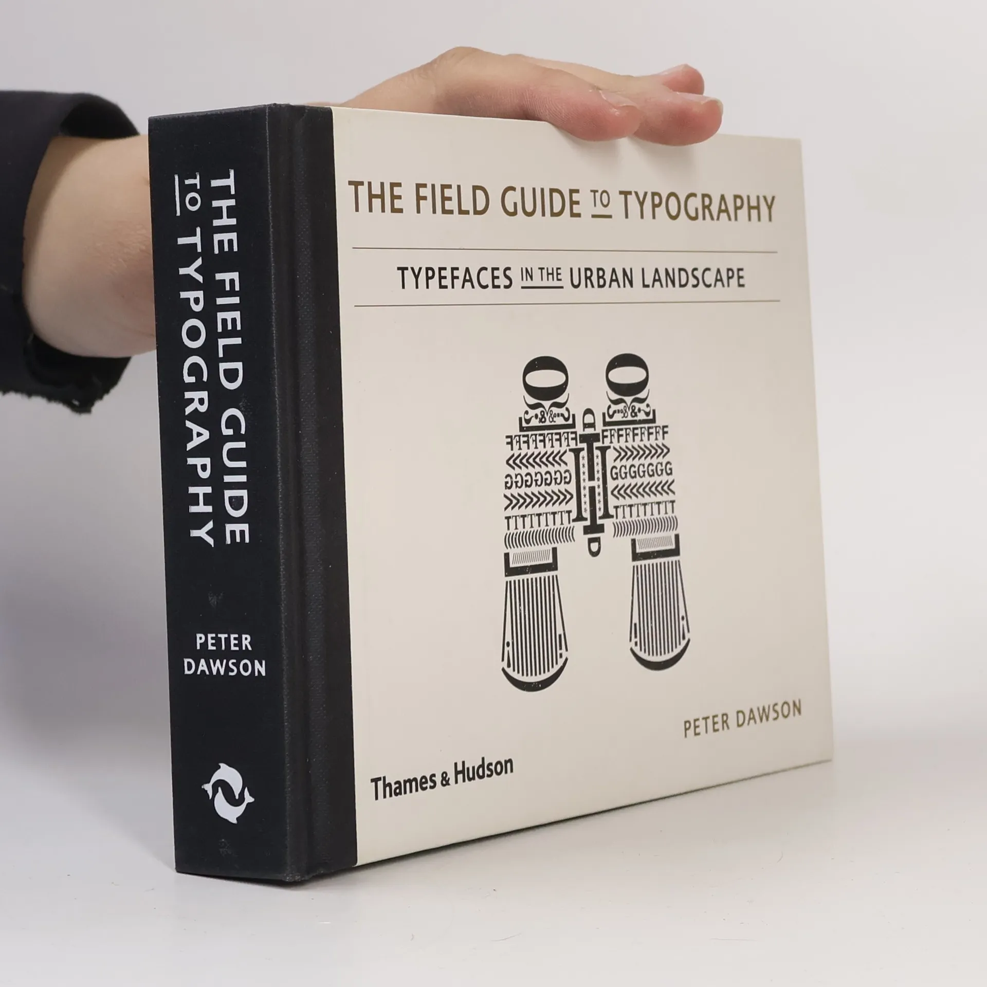
The Field Guide to Typography explores and explains the myriad typefaces that we see around us in our day-to-day lives, from airplane liveries to computer screens, from billboard hoardings to signage systems. It presents over 120 typefaces old and new, common and unusual with photographic references to help font spotters identify particular typefaces in the wild. Accompanying background information explains the origin, usage and key features of each typeface, and Field Facts provide little-known nuggets of information to expand your typographical awareness. Attractive and informative, The Field Guide to Typography is a unique visual reference for novice font fans and experienced designers alike, and a comprehensive celebration of our expanding typographic world.
Peter Dawson Boeken
Deze auteur staat bekend om zijn dynamische westernverhalen die de ruige schoonheid en onopgeloste conflicten van het Amerikaanse Westen vastleggen. Zijn stijl wordt gekenmerkt door levendige beschrijvingen van landschappen en complexe personages die zich begeven op de grens van beschaving en wildernis. Met een opmerkelijke productiviteit in het western-genre creëerde hij een uitgebreid oeuvre dat lezers aantrekt die op zoek zijn naar avontuur en morele dilemma's. Zijn verhaalmeesterschap ligt in zijn vermogen om spannende actie te combineren met een diepere verkenning van de menselijke natuur in een uitdagende omgeving.


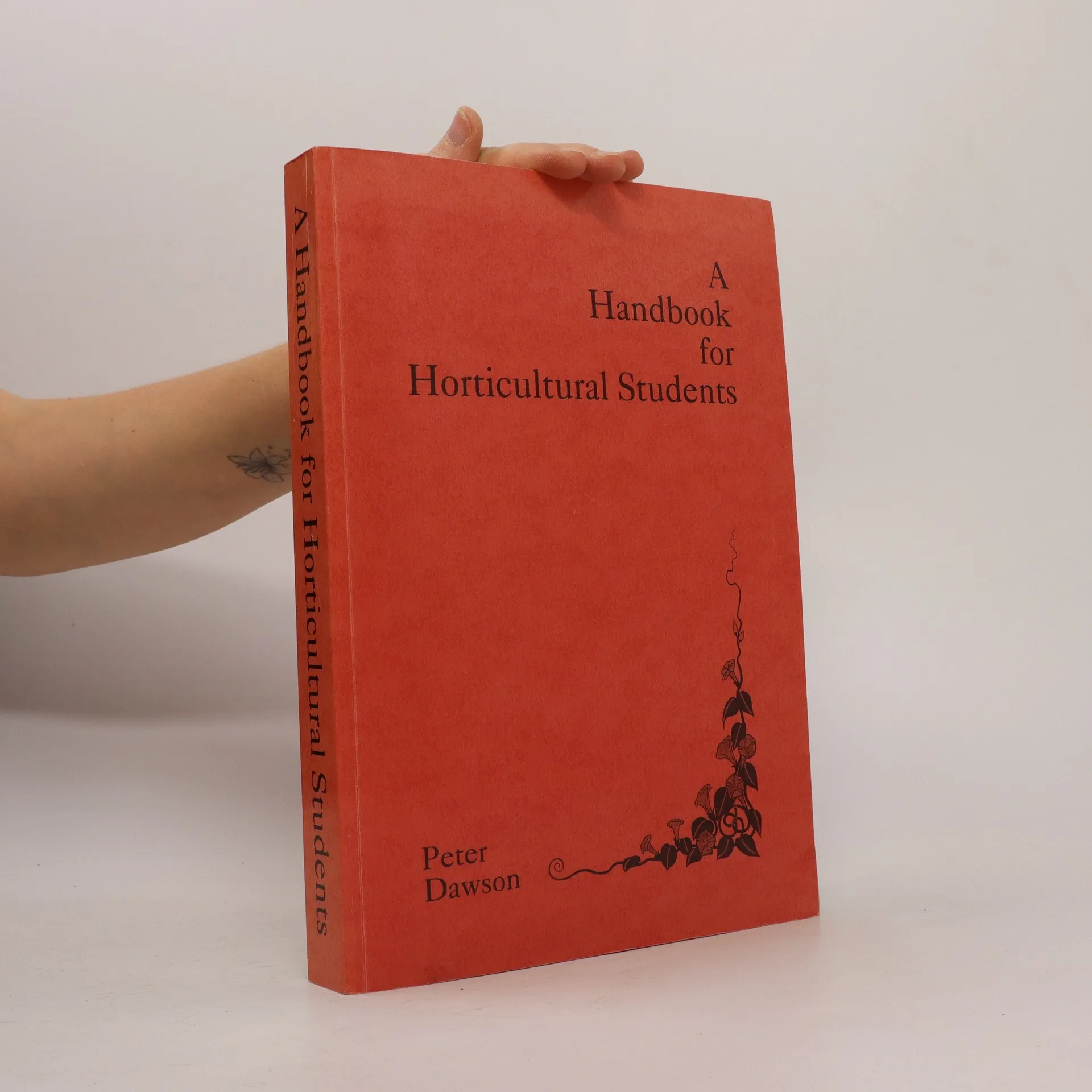
A Handbook for Horticultural Students
- 411bladzijden
- 15 uur lezen
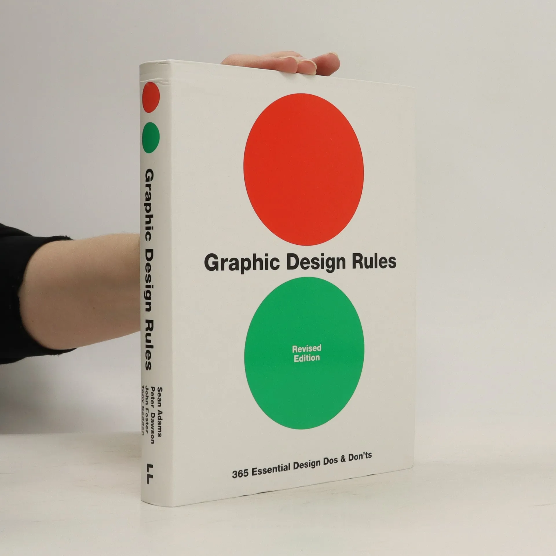
Graphic Design Rules
- 383bladzijden
- 14 uur lezen
365 daily design mantras from four leading industry experts, providing you with valuable design dos and don'ts for every day of year. Packed with practical advice presented in a fun, lighthearted fashion, this is the perfect book for the ever-growing group of non-designers who want some graphic design guidance. And for more experienced designers, individual entries will either bring forth knowing nods of agreement or hoots of derision, depending on whether or not the reader loves or hates hyphenation, has a pathological fear of beige, or thinks that baseline grids are boring. In the style of a classical almanac, 365 entries combine a specific rule with a commentary from a variety of experienced designers from all fields of the graphic design industry. Covering topics such as typography, colour, layout, imagery, production, and creative thinking, you can either dip in at random or use the book as the source of a daily lesson in how to produce great graphic design.